我们可以温柔,但不是妥协。要在安静的时光中,不慌不忙地学会坚强。
1、rotate练习
<div></div>div{
    overflow: hidden;width: 200px;height: 200px;background-color: pink;margin: 100px auto;
}
div::before{
    content: '王子最帅';display: block;width: 200px;height: 200px;background-color: palegreen;transform: rotate(180deg);transform-origin: left bottom;transition: all 0.6s;
}
div:hover::before{
    transform: rotate(0deg);
}
2、scale
可以设置中心放大点,不影响其他元素布局
例子:以左下角为中心进行放大1.2倍,超出父盒子的部分进行hidden操作


<div class="scale"><img src="../../static/image/wz.jpg" alt=""> </div><style>.scale{
    width: 800px;height: 800px;margin: 100px auto;border:1px solid red;overflow: hidden;}img{
    width: 100%;height: 100%;;}.scale img{
    transition: all 0.6s;transform-origin: left bottom;}.scale img:hover{
    transform: scale(1.2,1.2);}</style>
3、练习
鼠标经过页码数字放大显示
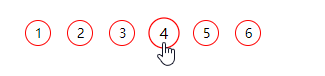
<div class="scale"><ul><li>1</li><li>2</li><li>3</li><li>4</li><li>5</li><li>6</li></ul>
</div>
    <style>.scale{
    margin: 200px auto;}.scale ul li{
    margin: 10px;float: left;width: 30px;height: 30px;border-radius: 50%;border: 1px solid red;text-align: center;line-height: 30px;list-style: none;transition: all .2s;cursor: pointer;}.scale ul li:hover{
    transform: scale(1.2);}</style>