【转载请注明出处:http://blog.csdn.net/feiduclear_up/article/details/46500865 CSDN 废墟的树】
在前不久的谷歌2014 I/O大会上,发布了Android新版本M,貌似从这个版本开始Android不在以数字命名版本了。
在这次的I/O大会上谷歌对Android并没有很大的改变,主要是修改完善之前Android L版本。不过在谷歌推出
Material Design设计风格之后,还是做了很多风格上的兼容,比如v7包的 RecyclerView,CardView,Palette等
这次的I/O大会上也继续完善了MD设计支持库,这次谷歌推出了Android Design Support Library 库,全面支持
MD设计风格的UI效果。Design Support Library库吸收了8 个新的 material design 组件!最低支持 Android
2.1,其实很多组件都是Github上比较火的,只是谷歌把它官方化了,便于开发者使用。今天我们来学习
FloatingActionButton,TextInputLayout,Snackbar,TabLayout 四种控件。
前提
为了能使用 这些 material design 组件,你需要去更新最新的SDK中的Extras支持库,如下图:
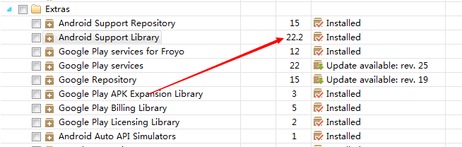
ps:在天朝上国,这种更新是需要翻墙的或者使用代理的,大家自行想办法。
更新完之后,在build.gralde文件下引入如下包:
compile 'com.android.support:design:22.2.0'现在,我们可以开始使用Material Design组件啦!来看看新组件有什么特别的地方吧!
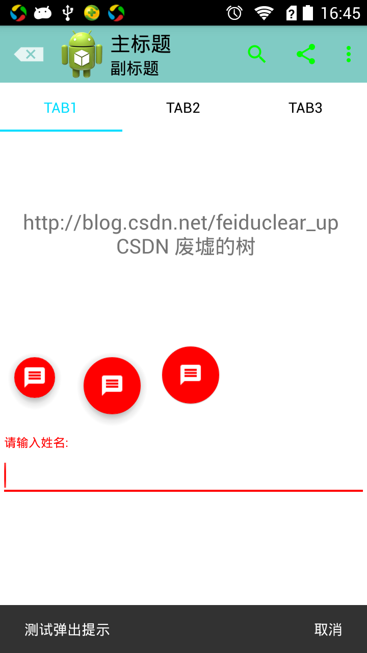
FloatingActionButton
顾名思义:这是一个浮动按钮。先上效果图啦!ps:没有效果图的UI博客很蛋疼的。

以上是三种不同效果的FloatingActionButton。XML布局代码如下:
<android.support.design.widget.FloatingActionButtonandroid:layout_width="wrap_content"android:layout_height="wrap_content"android:src="@drawable/ic_discuss"/>由于FloatingActionButton是重写ImageView的,所有FloatingActionButton拥有ImageView的一切属性。为了
控制FloatingActionButton的大小,背景颜色,阴影的深度等,我们可以通过如下属性来控制这些效果:
app:fabSize :FloatingActionButton的大小,有两种赋值分别是 “mini” 和 “normal”,默认是“normal”.
app:backgroundTint:FloatingActionButton的背景颜色,默认的背景颜色是Theme主题中的
<item name="colorAccent">#ff0000</item>颜色,不了解的童鞋们可以参考Android5.x新特性之 Toolbar和Theme的使用:http://blog.csdn.net/feiduclear_up/article/details/46457433。
3. app:elevation :FloatingActionButton阴影的深度,默认是有阴影的,如果觉得默认阴影深度有点大,可以改变这个属性来修改阴影深度。
上面三个效果图的XML布局代码如下:
<LinearLayoutandroid:layout_width="match_parent"android:layout_height="wrap_content"android:orientation="horizontal"><android.support.design.widget.FloatingActionButtonandroid:id="@+id/btn"android:layout_width="wrap_content"android:layout_height="wrap_content"android:src="@drawable/ic_discuss"app:fabSize="mini" /><android.support.design.widget.FloatingActionButtonandroid:layout_width="wrap_content"android:layout_height="wrap_content"android:src="@drawable/ic_discuss"/><android.support.design.widget.FloatingActionButtonandroid:layout_width="wrap_content"android:layout_height="wrap_content"android:src="@drawable/ic_discuss"app:backgroundTint="#000af4"app:fabSize="normal"app:elevation="1dp"/></LinearLayout>注意点
不能通过 android:background 属性来改变 FloatingActionButton的背景颜色,只能通过app:backgroundTint属性改变,因为FloatingActionButton是继承自ImageView的。
TextInputLayout
该控件是用于EditView输入框的,主要解决之前EditView在获得焦点编辑时hint属性提示语消失,这一点在一个页
面有多个EditView输入框的时候不是很好,因为很有可能用户在输入多个EditView之后,不知道当前EditView需
要输入什么内容。为了解决这一问题,TextInputLayout就此诞生了。TextInputLayout是继承自LinearLayout容
器布局,因此我们需要将EditView包含在TextInputLayout之内才可以使用,言外之意:TextInputLayout不能单
独使用。废话不多说,先上效果图啊:
XML布局代码如下:
<android.support.design.widget.TextInputLayoutandroid:id="@+id/textInput"android:layout_width="match_parent"android:layout_height="wrap_content"><EditTextandroid:layout_width="match_parent"android:layout_height="wrap_content"android:textColor="@android:color/black"/></android.support.design.widget.TextInputLayout>代码也可以看出TextInputLayout包裹着EditView。
为了达到以上效果,我们还需添加如下代码:
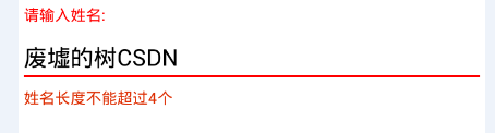
final TextInputLayout inputLayout = findView(R.id.textInput);inputLayout.setHint("请输入姓名:");EditText editText = inputLayout.getEditText();editText.addTextChangedListener(new TextWatcher() {@Overridepublic void beforeTextChanged(CharSequence s, int start, int count, int after) {}@Overridepublic void onTextChanged(CharSequence s, int start, int before, int count) {if (s.length()>4){inputLayout.setErrorEnabled(true);inputLayout.setError("姓名长度不能超过4个");}else{inputLayout.setErrorEnabled(false);}}@Overridepublic void afterTextChanged(Editable s) {}});TextInputLayout 不仅能让EditView的提示语上弹显示在EditView之上,而且还能把错误信息显示在EditView之下。
TextInputLayout常用的方法有如下:
setHint():设置提示语。
getEditText():得到TextInputLayout中的EditView控件。
setErrorEnabled():设置是否可以显示错误信息。
setError():设置当用户输入错误时弹出的错误信息。
注意点
TextInputLayout不能单独使用,需要包裹EditView组件。
Snackbar的使用
Snackbar提供了一个介于Toast和AlertDialog之间轻量级控件,它可以很方便的提供消息的提示和动作反馈。
废话不少说,妹子,上图:
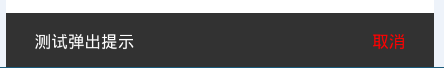
Snackbar的使用和Toast很类似,调用代码如下:
final Snackbar snackbar = Snackbar.make(inputLayout,"测试弹出提示",Snackbar.LENGTH_LONG);snackbar.show();snackbar.setAction("取消",new View.OnClickListener() {@Overridepublic void onClick(View v) {snackbar.dismiss();}});第一个参数View 可以是当前父布局中的任何一个view对象都可以。之后的参数和Toast参数一样。Snackbar可以
设置Action行为事件,使用的方法是public Snackbar setAction (CharSequence text, View.OnClickListener listener); Action的字体颜色默认使用系统主题中的如下颜色
<item name="colorAccent">#ff0000</item>当然你可以通过代码去改变Action的字体颜色:Snackbar setActionTextColor (int color);
注意
Snackbar是从整个界面的底部弹出。
源码地址:https://github.com/xujinping/AndroidDesignLibrary/tree/master