问题
用 Python 中的 matplotlib 绘图时,如何根据样本点的 label 设置不同的颜色?
# 生成样本点
from sklearn.datasets import make_classification
X, y = make_classification(n_samples=500,n_features=10,n_classes=5,n_informative=4,                          random_state=0)
# 默认绘图
import matplotlib.pyplot as plt
plt.figure(figsize=(8, 8))
plt.scatter(X[:, 0], X[:, 1], marker='o')默认绘图结果如下:

解决方案
1. 指定参数c
# 1. 指定参数c
plt.figure(figsize=(8, 8))
plt.scatter(X[:, 0], X[:, 1], marker='o', c='g')
绘图结果如下:

(图片来源:https://blog.csdn.net/qiu931110/article/details/68130199)
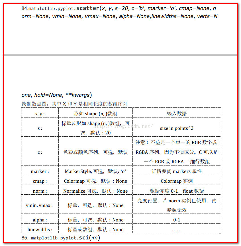
参数c 可以等于:['c', 'b', 'g', 'r', 'm', 'y', 'k', 'w']
b——blue
c——cyan
g——green
k——black
m——magenta
r——red
w——white
y——yellow
2. c=list,设置cmap
# 2. c=y,设置cmap
plt.figure(figsize=(8, 8))
plt.scatter(X[:, 0], X[:, 1], marker='o', c=y, cmap='coolwarm')
绘图结果如下:

cmap 可以的取值可多了…演示一下:
plt.figure(figsize=(12, 8))
plt.subplot(231)
plt.scatter(X[:, 0], X[:, 1], marker='o', c=y, cmap='plasma')
plt.subplot(232)
plt.scatter(X[:, 0], X[:, 1], marker='o', c=y, cmap='Oranges')
plt.subplot(233)
plt.scatter(X[:, 0], X[:, 1], marker='o', c=y, cmap='summer')
plt.subplot(234)
plt.scatter(X[:, 0], X[:, 1], marker='o', c=y, cmap='Spectral')
plt.subplot(235)
plt.scatter(X[:, 0], X[:, 1], marker='o', c=y, cmap='Set1')
plt.subplot(236)
plt.scatter(X[:, 0], X[:, 1], marker='o', c=y, cmap='rainbow')
plt.show()
结果如下图:

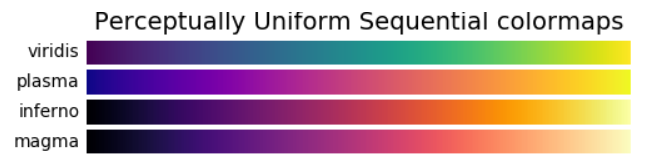
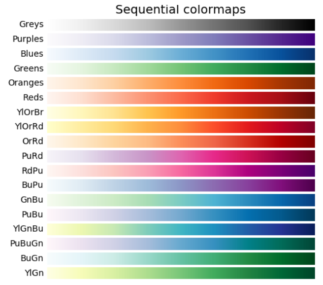
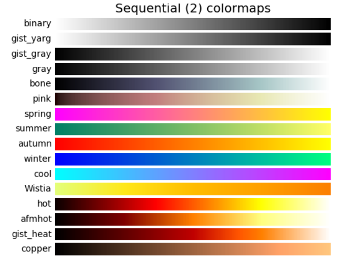
colormap,也称color bar,matplotlib模块中内嵌了一大批常用的colormaps。请参阅官方文档 color example code: colormaps_reference.py
import numpy as np
import matplotlib.pyplot as plt# Have colormaps separated into categories:
# http://matplotlib.org/examples/color/colormaps_reference.html
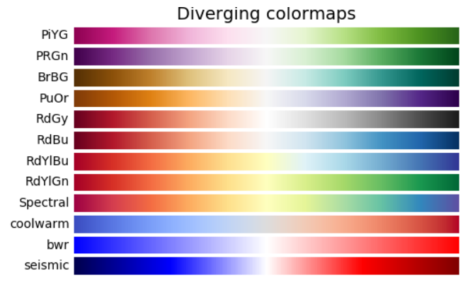
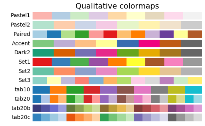
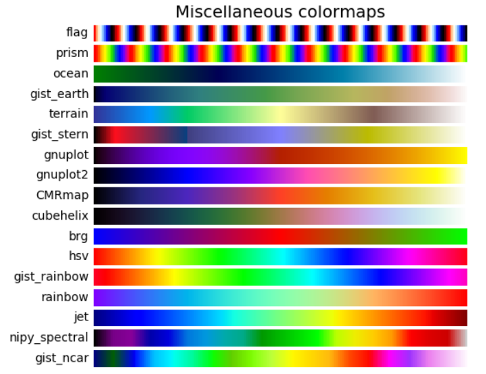
cmaps = [('Perceptually Uniform Sequential', ['viridis', 'plasma', 'inferno', 'magma']),('Sequential', ['Greys', 'Purples', 'Blues', 'Greens', 'Oranges', 'Reds','YlOrBr', 'YlOrRd', 'OrRd', 'PuRd', 'RdPu', 'BuPu','GnBu', 'PuBu', 'YlGnBu', 'PuBuGn', 'BuGn', 'YlGn']),('Sequential (2)', ['binary', 'gist_yarg', 'gist_gray', 'gray', 'bone', 'pink','spring', 'summer', 'autumn', 'winter', 'cool', 'Wistia','hot', 'afmhot', 'gist_heat', 'copper']),('Diverging', ['PiYG', 'PRGn', 'BrBG', 'PuOr', 'RdGy', 'RdBu','RdYlBu', 'RdYlGn', 'Spectral', 'coolwarm', 'bwr', 'seismic']),('Qualitative', ['Pastel1', 'Pastel2', 'Paired', 'Accent','Dark2', 'Set1', 'Set2', 'Set3','tab10', 'tab20', 'tab20b', 'tab20c']),('Miscellaneous', ['flag', 'prism', 'ocean', 'gist_earth', 'terrain', 'gist_stern','gnuplot', 'gnuplot2', 'CMRmap', 'cubehelix', 'brg', 'hsv','gist_rainbow', 'rainbow', 'jet', 'nipy_spectral', 'gist_ncar'])]nrows = max(len(cmap_list) for cmap_category, cmap_list in cmaps)
gradient = np.linspace(0, 1, 256)
gradient = np.vstack((gradient, gradient))def plot_color_gradients(cmap_category, cmap_list, nrows):fig, axes = plt.subplots(nrows=nrows)fig.subplots_adjust(top=0.95, bottom=0.01, left=0.2, right=0.99)axes[0].set_title(cmap_category + ' colormaps', fontsize=14)for ax, name in zip(axes, cmap_list):ax.imshow(gradient, aspect='auto', cmap=plt.get_cmap(name))pos = list(ax.get_position().bounds)x_text = pos[0] - 0.01y_text = pos[1] + pos[3]/2.fig.text(x_text, y_text, name, va='center', ha='right', fontsize=10)# Turn off *all* ticks & spines, not just the ones with colormaps.for ax in axes:ax.set_axis_off()for cmap_category, cmap_list in cmaps:plot_color_gradients(cmap_category, cmap_list, nrows)plt.show()‘Perceptually Uniform Sequential’:
‘Sequential’:
‘Sequential2’:
Diverging:
Qualitative:
Miscellaneous:
参考来源
非常感谢:【python图像处理】彩色映射
此外更多参考阅读:
- 官方文档 color example code: colormaps_reference.py
- 【python图像处理】彩色映射(续篇)
- PYthon——plt.scatter各参数详解
- 原 matplotlib散点scatter学习2,参数测试(marker1)