������������硷 ��UIƪ
��������������Լ� androidѧϰ֮·
ת���뱣������ by Qiao
http://blog.csdn.net/qiaoidea/article/details/46715453
1.����
����Android�й��ڿ��ƿ��غ�ҳ��/״̬�л���ʹ�ó������DZȽ϶�ġ�Դ������֧��Ҳ�б���RadioGroup ��Tabhost�ȡ�������ͨ���Զ���View��ģ��ѧϰ��IOS���ֳ���UI��ʽ�� SwitchButton �� SegmentControl��
����������ͨ��������װView��ʵ������UI����ӦЧ��������أ�����ͨ���������ﵽͬ���ĸ�������ʽ������ǰ��ʵ�ְ�ť�л���ҳ���л�������ʽ������ʵ�ַ��������У�����SwitchButtonʵ�֣�һ��SegmentControlʵ�֡�ʵ�ַ����й����Զ���View���ƣ���ƪֻ����SwitchView��ϣ������ܾ�һ������ͬ������SegmentControl����ͬЧ��������Ҳ��������ʹ���Զ���ʵ�֣���������
�����ȿ�Ч��ͼ��
����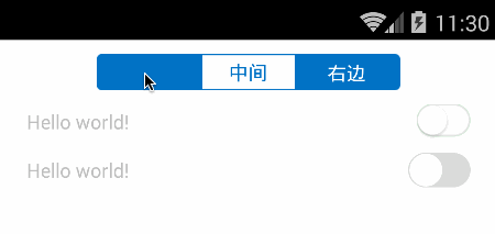
����ͷ����Ϊ�л�ҳ���SegmentControl��Ȼ���һ����ͨ����װview��ʵ��SwitchButton���ڶ���������ȫ���Ƴ�����SwitchButtonЧ�������������Ƿֱ�һһ��������ʵ�֡�
2.SwitchButton��ʽ����ʵ��
����״̬���ذ�ť������ijЩ���ƿ��أ�����ѡ������Ϊ������
2.1 ���Viewʵ��
�����÷����Ƚϼ����ˣ���������view������״̬�ر�״̬��������View��һ��Բ�ΰ�ťview�����ʱ�����û��������ƶ���ť��״̬�������ﵽ���Ƶ��Ӿ�Ч����
�����ȿ�xml���֣�
<?xml version="1.0" encoding="utf-8"?><merge xmlns:android="http://schemas.android.com/apk/res/android" android:layout_width="match_parent" android:layout_height="match_parent" > <FrameLayout android:layout_width="wrap_content" android:layout_height="wrap_content" > <ImageView android:id="@+id/on_bg_view" android:layout_width="wrap_content" android:layout_height="wrap_content" android:src="@drawable/switch_on_bg" /> <ImageView android:id="@+id/off_bg_view" android:layout_width="wrap_content" android:layout_height="wrap_content" android:src="@drawable/switch_off_bg" /> </FrameLayout> <ImageView android:id="@+id/circle_view" android:layout_width="wrap_content" android:layout_height="wrap_content" android:src="@drawable/switch_circle" /></merge>������Ϊ��֡���֣����Զ���ʹ��merge��merge��xml�����ͣ����аٶȣ���Ȼ��ʹ����������״̬������һ��Բ�ΰ�ť��϶��ɡ�
1. ȫ�ֱ�������
public class SwitchView extends FrameLayout { protected boolean isChecked; //�Ƿ�ѡ��״̬ protected View onBgView; protected View offBgView; protected View circleView; protected boolean autoForPerformClick = true; //�Ƿ���������Զ��л� protected OnCheckedChangedListener onCheckedChangedListener; //�л��¼����� //...}����һ��״̬�л�����click�¼�����������ҵ�������ж��Ƿ��л�״̬��������switchButton,ͨ�����Dz���ʱֱ�۸���Ӧ�������л���״̬��ִ����Ӧ�����ģ�����������performClick�¼���ֱ�Ӹ���autoForPerformClick ��״̬����Ӧ���������
����performClick ����ʵ���ǿ�������onClickListener�ķ����壬��������ViewԴ���в鿴��
2. ��ʼ��
public SwitchView(Context context) { super(context); initialize(); } public SwitchView(Context context, AttributeSet attrs) { super(context, attrs); initialize(); } public SwitchView(Context context, AttributeSet attrs, int defStyle) { super(context, attrs, defStyle); initialize(); } protected void initialize() { setClickable(true); LayoutInflater layoutInflater = (LayoutInflater) getContext().getSystemService(Context.LAYOUT_INFLATER_SERVICE); layoutInflater.inflate(R.layout.switch_view, this); onBgView = findViewById(R.id.on_bg_view); offBgView = findViewById(R.id.off_bg_view); circleView = findViewById(R.id.circle_view); }3. �����Ӧ
@Override public boolean performClick() { if (!autoForPerformClick) //��������Զ���Ӧ�����Ĭ�ϴ������� return super.performClick(); /** *����ֱ���л�switch״̬�������¼����� */ setChecked(!isChecked, true); if (onCheckedChangedListener != null) { onCheckedChangedListener.onChanged(this, isChecked); } return super.performClick(); }����View������ִ��performClick���������ж��Ƿ����clickLisentener����������ֱ����дperformClick����������Զ���ӦautoForPerformClickΪture��ֱ���л�Switch״̬���������Ĭ�ϴ�������
4.�л�״̬����
�����������Բ�ΰ�ť����˻������Ҷˣ�onBg��ʾ��offBg���أ�
�����ٵ���رգ�Բ�ΰ�ť���Ҷ˻�������ˣ�onBg����,offBg��ʾ��
public void setChecked(boolean value, boolean needAnimate) { if (isChecked == value) return; isChecked = value; float targetX = 0; //Ҫ�ƶ���Ŀ��λ�� if (getWidth() != 0) { //��ǰviewû����Ⱦ��ȥʱ��getWidth()Ϊ�� targetX = getWidth() - circleView.getWidth(); } else { measure(0, 0); targetX = getMeasuredWidth() - circleView.getMeasuredWidth(); } long durationMillis = needAnimate ? 200 : 0; if (isChecked) { onBgView.bringToFront(); //��ʾ����ǰ�� onBgView.setVisibility(View.VISIBLE); offBgView.setVisibility(View.VISIBLE); //ƽ�ƶ��� TranslateAnimation an1 = new TranslateAnimation(0, targetX, 0, 0); an1.setFillAfter(true); an1.setDuration(durationMillis); circleView.startAnimation(an1); //���ȶ��� AlphaAnimation an2 = new AlphaAnimation(0, 1); an2.setFillAfter(true); an2.setDuration(durationMillis); onBgView.startAnimation(an2); } else { offBgView.bringToFront(); onBgView.setVisibility(View.VISIBLE); offBgView.setVisibility(View.VISIBLE); TranslateAnimation an1 = new TranslateAnimation(targetX, 0, 0, 0); an1.setFillAfter(true); an1.setDuration(durationMillis); circleView.startAnimation(an1); AlphaAnimation an2 = new AlphaAnimation(0, 1); an2.setFillAfter(true); an2.setDuration(durationMillis); offBgView.startAnimation(an2); } }����״̬�л�������������value�Ƿ��״̬��needAnimate�Ƿ���Ҫ����������ֱ���л�Ч������setFillAfter������������״̬��������Ӱ��View����λ�ú�״̬���л�ʱ���Ƚ���ǰ��ʾ�����ƶ�����ǰ�ˣ�������Ӱ�ť�����ͽ���������
�������ˣ�����������Viewʵ���Ѿ�����ˡ���Ҫ�˽����������Դ���в鿴��Դ���Ϊ�����֣�һ����Ŀ��View��ʵ��lib����һ����ʾ����ʾdemo.
����
2.2 �Զ���View����ʵ��
�������ڸ���ʽ����ʮ�ָ��ӣ����Կ���ͨ��������ͼ�λ���draw��ͬ����Ч����
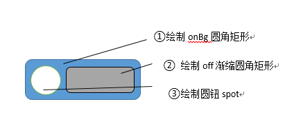
��������ʵ������ͨ���Զ�view������ȷ����ť��С���м�Բť��С���ڲ���onMesure�����п��Ʋ���ֵmode��Size������onLayout�����еõ�Բť�뾶����ʼ��λ�á�Ȼ����л��ƣ��Ȼ��Ƶײ�onԲ�Ǿ��α������ٻ���off�������ŵ�Բ�Ǿ��Σ�������spotԲť��
������Ƚϱ����ֲ��ửͼ����word��ͼ�ι��߽��ͻ��¿��Կ��ͺ��ˡ�
����
��������ʵ�ִ��嶼���ƣ�����������Ҫ���ִ���
1.ȫ�ֲ�����
public class SwitchButton extends View{ /** */ private float radius; /** ������ɫ*/ private int onColor = Color.parseColor("#4ebb7f"); /** �ر���ɫ*/ private int offBorderColor = Color.parseColor("#dadbda"); /** ��ɫ����ɫ*/ private int offColor = Color.parseColor("#ffffff"); /** �ֱ���ɫ*/ private int spotColor = Color.parseColor("#ffffff"); /** �߿���ɫ*/ private int borderColor = offBorderColor; /** ����*/ private Paint paint ; /** ����״̬*/ private boolean toggleOn = false; /** �߿��С*/ private int borderWidth = 2; /** ��ֱ����*/ private float centerY; /** ��ť�Ŀ�ʼ�ͽ���λ��*/ private float startX, endX; /** �ֱ�Xλ�õ���С�����ֵ*/ private float spotMinX, spotMaxX; /**�ֱ���С */ private int spotSize ; /** �ֱ�Xλ��*/ private float spotX; /** �ر�ʱ�ڲ���ɫ���߶�*/ private float offLineWidth; /** */ private RectF rect = new RectF(); /** Ĭ��ʹ�ö���*/ private boolean defaultAnimate = true; private OnSwitchChanged listener; //...}2.��ʼ�����ȡ��
������ȡ�Զ������Բ���ֵ�������ֽ��Ķ������ԡ�
3.����onMeasure�벼��onLayout
������onMeasure�����и��ݸ���mode��size����View������߿���Ϊ��ȷֵ��UNSPECIFIED/AT_MOST��,���������߿�Ϊ��ȷֵ��������MeasureSpec����ϸ���⣬���︽�ϰ����һƪ���¨CMeasureSpec�����뵽��ֵ��ȡ���ڲ����������������о��¡���Ȼ����ֱ�ӵķ������ǵ㿪Դ��һ̽��������
����onLayout������ȡ��view��ʵ�ʸ߿��������Բ�Ǿ��ΰ뾶��Բť�뾶�Լ���ʼ��x����λ�á�����On���κ�off���εĿ��ȡ�
@Override protected void onMeasure(int widthMeasureSpec, int heightMeasureSpec) { final int widthMode = MeasureSpec.getMode(widthMeasureSpec); final int heightMode = MeasureSpec.getMode(heightMeasureSpec); int widthSize = MeasureSpec.getSize(widthMeasureSpec); int heightSize = MeasureSpec.getSize(heightMeasureSpec); /** *����߿�δָ������ʹ�����ø߿���ȷ��С */ Resources r = Resources.getSystem(); if(widthMode == MeasureSpec.UNSPECIFIED || widthMode == MeasureSpec.AT_MOST){ widthSize = (int) TypedValue.applyDimension(TypedValue.COMPLEX_UNIT_DIP, 50, r.getDisplayMetrics()); widthMeasureSpec = MeasureSpec.makeMeasureSpec(widthSize, MeasureSpec.EXACTLY); } if(heightMode == MeasureSpec.UNSPECIFIED || heightSize == MeasureSpec.AT_MOST){ heightSize = (int) TypedValue.applyDimension(TypedValue.COMPLEX_UNIT_DIP, 30, r.getDisplayMetrics()); heightMeasureSpec = MeasureSpec.makeMeasureSpec(heightSize, MeasureSpec.EXACTLY); } super.onMeasure(widthMeasureSpec, heightMeasureSpec); } @Override protected void onLayout(boolean changed, int left, int top, int right, int bottom) { super.onLayout(changed, left, top, right, bottom); final int width = getWidth(); final int height = getHeight(); /** *������Ӧ��С */ radius = Math.min(width, height) * 0.5f; centerY = radius; startX = radius; endX = width - radius; spotMinX = startX + borderWidth; spotMaxX = endX - borderWidth; spotSize = height - 4 * borderWidth; spotX = toggleOn ? spotMaxX : spotMinX; offLineWidth = 0; }����ǰ������ɻ�����ֵ֮��ʼ���úͰ���Ӧ�¼������ﲻ��Ϊ�ص㲿��Ҳʡ�ԣ���Ҫ��һ�»��ƹ��̺ͺ��Ŀ�������
��������
4.���ƹ���
��������ǰ��ļ���ʾ��ͼ���������ǵ�uiͼ��
@Override public void draw(Canvas canvas) { //����on���� rect.set(0, 0, getWidth(), getHeight()); paint.setColor(borderColor); canvas.drawRoundRect(rect, radius, radius, paint); //����off������������0ʱ���ƣ� if(offLineWidth > 0){ final float cy = offLineWidth * 0.5f; rect.set(spotX - cy, centerY - cy, endX + cy, centerY + cy); paint.setColor(offColor); canvas.drawRoundRect(rect, cy, cy, paint); } //����Բť����border rect.set(spotX - 1 - radius, centerY - radius, spotX + 1.1f + radius, centerY + radius); paint.setColor(borderColor); canvas.drawRoundRect(rect, radius, radius, paint); //����Բť final float spotR = spotSize * 0.5f; rect.set(spotX - spotR, centerY - spotR, spotX + spotR, centerY + spotR); paint.setColor(spotColor); canvas.drawRoundRect(rect, spotR, spotR, paint); }�������������������ǵ�״̬�л��������������������ť֮��setToggleOn����setToggleOffִ�е���Ӧ������
4.״̬�л�����Ч��
/** * ִ��Ч�������animateΪtrue��ʾ�ж���Ч�� * ����ֱ��ִ�м��㲢��ʾ���մ�"1"���߹ر�"0"��Ч������ */ private void takeEffect(boolean animate) { if(animate){ slide(); }else{ calculateEffect(toggleOn ? 1 : 0); } } /** *����͵������ֱ��ʹ�ÿյ�animation�����ݵ�ǰinterpolatedTime��0~1��������������Ʋ�ͬ�ε�View���ﵽ����Ч�� *��Ȼ��Ҳ���Կ������̻߳��߶�ʱ������ʵ�ִ�0��1�ı任�������ı���ͼ���ƹ��� */ private void slide(){ Animation animation = new Animation() { @Override protected void applyTransformation(float interpolatedTime, Transformation t) { if(toggleOn){ calculateEffect(interpolatedTime); }else{ calculateEffect(1-interpolatedTime); } } }; animation.setDuration(200); clearAnimation(); startAnimation(animation); } /** *�������λ�� *mapValueFromRangeToRange��������ӵ�ǰλ�������Ŀ��λ������Ӧ��ֵ *ͨ����ɫ�仯���ﵽ���ȶ���Ч������ɫ���䣩 */ private void calculateEffect(final double value) { final float mapToggleX = (float) mapValueFromRangeToRange(value, 0, 1, spotMinX, spotMaxX); spotX = mapToggleX; float mapOffLineWidth = (float) mapValueFromRangeToRange(1 - value, 0, 1, 10, spotSize); offLineWidth = mapOffLineWidth; final int fb = Color.blue(onColor); final int fr = Color.red(onColor); final int fg = Color.green(onColor); final int tb = Color.blue(offBorderColor); final int tr = Color.red(offBorderColor); final int tg = Color.green(offBorderColor); int sb = (int) mapValueFromRangeToRange(1 - value, 0, 1, fb, tb); int sr = (int) mapValueFromRangeToRange(1 - value, 0, 1, fr, tr); int sg = (int) mapValueFromRangeToRange(1 - value, 0, 1, fg, tg); sb = clamp(sb, 0, 255); sr = clamp(sr, 0, 255); sg = clamp(sg, 0, 255); borderColor = Color.rgb(sr, sg, sb); postInvalidate(); }�������Ͼ����Զ���View���Ƶĺ��Ĵ��룬��ϸ�鿴Դ��SwitchButton���������Ϸ�����������ݣ�Ҳ�и��ߵ�����Ժ���չ�ԡ�ͬʱ������ҪͼƬ��Դ֧�֡�
3.SegmentControl��ʽʵ��
����������Tab�кܶ��֣�����ʹ�õ���IOS������һ���л�Ч��SegmentControl����ƪֻ�����ƴװViewʵ������Ч��������Ȥ�Ŀ����Լ����Ի��ƴﵽ����Ч�������пյĻ�Ҳ���ں�߷ų���
- ͨ��view������� ������ķ�����û��֮һ��ʹ���ֳɵ�selector�ͱ�����������ʾЧ����������view�ֱ�̳� RelativeLayout��ʵ��OnClick�ӿڡ������Segment�п�����ʾ�͵���л���
- �Զ���View�������� ����ֻ���ṩ˼·������һ��ItemView,������Segment��λ�û�֮��ͬЧ��������Ч������selector.xml�Ķ�֪����ʹ��shape��ǩ������drawable������ʵ����һ��GradientDrawable�����������Զ���view����ֱ��ͨ��ʹ��GradientDrawable��setCornerRadii(float[] radii) ������ͬ���ı���Ч������������������ͬ��ɫ�����ʹ��һ��ViewGroup������Щitem���ɡ�ͨ��click�¼����л�tab�Ϳ����ˡ�
3.1 ���Viewʵ��
�������ȣ����ƵĶ���һ���ɵ����ͨ�õ�RelativLayout����ʵ�� Checkable�ӿ�ʹ��ɱ�ѡ��Ҳ�Ƴ�ѡ��״̬����ϸ���Բο�ǰ��IJ��� ��/��̬ ����Ч�����������漰���������ݣ���˵�������¡�
����
- checkMode ѡ��ģʽ���ǵ�ѡ CHECKMODE_CHECK ���� CHECKMODE_RADIO ��ѡЧ����ʹ���ǵ��Զ���RelativeLayout����������ѡ��ѡ��
- onInitializeAccessibilityEvent ����View�����¼�Դ��Ϣ��������checked�¼��������¼��������ڲ���view�����������������Ӧ�ý��ղ�������Ӧ��checked�¼�����Ȼ��ʹ�ø÷�������Ҫ��дonInitializeAccessibilityNodeInfo�������������ǹ�ע��״̬��Ϣ��
- SavedState״̬���� �������ڲ�����Ƕ����view��ʱ��Ϊ�˷�ֹ����״̬��ʧ��һ����Ҫ����״̬�����࣬���Ա���ͻָ���ǰView״̬��
#### 1.�ɵ����ͨ��RelativeLayout
- �̳�ʵ��Clickable�ӿ�����Ҫ�Թ���
//����checked״̬ public static final int[] CHECKED_STATE_SET = { android.R.attr.state_checked }; //��дSetChecked������isChecked������ /** *���ݵ�ǰѡ��ģʽcheckMode �����Ƶ���ѡ */ @Override public boolean performClick() { if (checkMode == CHECKMODE_CHECK) { toggle(); } else if (checkMode == CHECKMODE_RADIO) { setChecked(true); } return super.performClick(); } /** *����Drawable ��checked״̬ �����ٻ���view�ǻ�����Ӧ״̬Ч�� */ @Override public int[] onCreateDrawableState(int extraSpace) { int[] states = super.onCreateDrawableState(extraSpace + 1); if (isChecked()) { mergeDrawableStates(states, CHECKED_STATE_SET); } return states; } @Override protected void drawableStateChanged() { super.drawableStateChanged(); Drawable drawable = getBackground(); if (drawable != null) { int[] myDrawableState = getDrawableState(); drawable.setState(myDrawableState); invalidate(); } }- ����checked״̬�¼���Ϣ
@Override public void onInitializeAccessibilityEvent(AccessibilityEvent event) { super.onInitializeAccessibilityEvent(event); event.setClassName(CheckedRelativeLayout.class.getName()); event.setChecked(checked); } @Override public void onInitializeAccessibilityNodeInfo(AccessibilityNodeInfo info) { super.onInitializeAccessibilityNodeInfo(info); info.setClassName(CheckedRelativeLayout.class.getName()); info.setCheckable(true); info.setChecked(checked); }- ����View״̬�ͻָ�
����View������д����ͻָ��ķ���
����@Override public Parcelable onSaveInstanceState() {//���� Parcelable superState = super.onSaveInstanceState(); SavedState ss = new SavedState(superState); ss.checked = isChecked(); return ss; } @Override public void onRestoreInstanceState(Parcelable state) {//�ָ� SavedState ss = (SavedState) state; super.onRestoreInstanceState(ss.getSuperState()); setChecked(ss.checked); requestLayout(); }�������ڱ������ݵĻ���״̬����
static class SavedState extends BaseSavedState { boolean checked; SavedState(Parcelable superState) { super(superState); } private SavedState(Parcel in) { super(in); checked = (Boolean) in.readValue(null); } @Override public void writeToParcel(Parcel out, int flags) { super.writeToParcel(out, flags); out.writeValue(checked); } public static final Creator<SavedState> CREATOR = new Creator<SavedState>() { public SavedState createFromParcel(Parcel in) { return new SavedState(in); } public SavedState[] newArray(int size) { return new SavedState[size]; } }; } @Override public String toString() { return "CompoundButton.SavedState{" + Integer.toHexString(System.identityHashCode(this)) + " checked=" + checked + "}"; }2.����tab���SegmentView
��������Ƚ��������⣬����ֱ�����������ļ��ɡ�
��������˼·��ˮƽ���Բ��ְ�����Ӧ�����Ҳ�ͬitem������ѡ���ͨ�����ö�Ӧleft/right/center�����ñ�����Ȼ��ֱ�Ϊÿ��Item����ͬһ������¼������֮�����Ƿ�ǰitem��ѡ�У��ı�statu��ͬʱ�����л��¼�����ϸ���룺
public class SegmentView extends LinearLayout { protected final static int SEGMENT_LEFT_BG = R.drawable.segment_left_selector; protected final static int SEGMENT_CENTER_BG = R.drawable.segment_center_selector; protected final static int SEGMENT_RIGHT_BG = R.drawable.segment_right_selector; protected int leftBg = SEGMENT_LEFT_BG; protected int centerBg = SEGMENT_CENTER_BG; protected int rightBg = SEGMENT_RIGHT_BG; protected CheckedRelativeLayout2[] checkedRelativeLayouts; protected int index = -1; protected float textSize = -1; protected int textColorN = Color.BLACK, textColorP = Color.BLACK; protected OnIndexChangedListener onIndexChangedListener; public SegmentView(Context context) { super(context); initialize(); } public SegmentView(Context context, AttributeSet attrs) { super(context, attrs); initialize(); initFromAttributes(context, attrs); } public SegmentView(Context context, AttributeSet attrs, int defStyle) { super(context, attrs, defStyle); initialize(); initFromAttributes(context, attrs); } protected void initialize() { setGravity(Gravity.CENTER); } protected void initFromAttributes(Context context, AttributeSet attrs) { TypedArray a = context.obtainStyledAttributes(attrs, R.styleable.SegmentView); String content = a.getString(R.styleable.SegmentView_content); index = a.getInt(R.styleable.SegmentView_index, index); textSize = a.getDimension(R.styleable.SegmentView_textSize, textSize); textColorN = a.getColor(R.styleable.SegmentView_textColorN, textColorN); textColorP = a.getColor(R.styleable.SegmentView_textColorP, textColorP); leftBg = a.getResourceId(R.styleable.SegmentView_leftBg, leftBg); centerBg = a.getResourceId(R.styleable.SegmentView_centerBg, centerBg); rightBg = a.getResourceId(R.styleable.SegmentView_rightBg, rightBg); a.recycle(); if (!TextUtils.isEmpty(content)) { String[] contentStrings = content.split(","); setContent(contentStrings); } setIndex(index); } public void setContent(String... content) { View[] views = new View[content.length]; for (int i = 0, len = content.length; i < len; i++) { String s = content[i]; TextView tv = new TextView(getContext()); tv.setTextColor(textColorN); tv.setText(s); if (textSize != -1) { tv.setTextSize(TypedValue.COMPLEX_UNIT_PX, textSize); } views[i] = tv; } setContent(views); } public void setContent(View... content) { removeAllViews(); int lastIndex = content.length - 1; checkedRelativeLayouts = new CheckedRelativeLayout2[content.length]; checkedRelativeLayouts[0] = createLeftView(content[0]); checkedRelativeLayouts[lastIndex] = createRightView(content[lastIndex]); for (int i = 1; i < lastIndex; i++) { checkedRelativeLayouts[i] = createCenterView(content[i]); } for (View view : checkedRelativeLayouts) { LayoutParams llp = new LayoutParams(LayoutParams.WRAP_CONTENT, LayoutParams.MATCH_PARENT); llp.weight = 1; addView(view, llp); } } public int getIndex() { return index; } public void setIndex(int i) { if (i < 0) return; checkedRelativeLayouts[i].setChecked(true); } public void setTextColorN(int textColorN) { this.textColorN = textColorN; } public void setTextColorP(int textColorP) { this.textColorP = textColorP; } protected CheckedRelativeLayout.OnCheckedChangeListener checkedChangeListener = new CheckedRelativeLayout.OnCheckedChangeListener() { @Override public void onCheckedChanged(CheckedRelativeLayout layout, boolean isChecked) { if (isChecked) { for (CheckedRelativeLayout2 item : checkedRelativeLayouts) { if (!item.equals(layout)) { item.setChecked(false); } } if (onIndexChangedListener != null) { int i = indexOf(checkedRelativeLayouts, layout); index = i; if (onIndexChangedListener != null) { onIndexChangedListener.onChanged(SegmentView.this, index); } } } } }; protected CheckedRelativeLayout2 createLeftView(View contentView) { CheckedRelativeLayout2 layout = new CheckedRelativeLayout2(getContext()); layout.setBackgroundResource(leftBg); layout.setGravity(Gravity.CENTER); layout.addView(contentView); layout.setOnCheckedChangeListener(checkedChangeListener); return layout; } protected CheckedRelativeLayout2 createCenterView(View contentView) { CheckedRelativeLayout2 layout = new CheckedRelativeLayout2(getContext()); layout.setBackgroundResource(centerBg); layout.setGravity(Gravity.CENTER); layout.addView(contentView); layout.setOnCheckedChangeListener(checkedChangeListener); return layout; } protected CheckedRelativeLayout2 createRightView(View contentView) { CheckedRelativeLayout2 layout = new CheckedRelativeLayout2(getContext()); layout.setBackgroundResource(rightBg); layout.setGravity(Gravity.CENTER); layout.addView(contentView); layout.setOnCheckedChangeListener(checkedChangeListener); return layout; } public void setOnIndexChangedListener(OnIndexChangedListener l) { this.onIndexChangedListener = l; } protected class CheckedRelativeLayout2 extends CheckedRelativeLayout { protected TextView textView; public CheckedRelativeLayout2(Context context) { super(context); } @Override public void addView(View child) { super.addView(child); if (child instanceof TextView) { textView = (TextView) child; } } @Override public void setChecked(boolean checked) { super.setChecked(checked); if (textView != null) { if (checked) { textView.setTextColor(textColorP); } else { textView.setTextColor(textColorN); } } } } public static interface OnIndexChangedListener { public void onChanged(SegmentView view, int index); } public static <T> int indexOf(T[] array, T obj) { for (int i = 0, len = array.length; i < len; i++) { if (array[i].equals(obj)) return i; } return -1; }}�����÷����Ƚϼ�ª��������ɫ�����Բ��ߡ���ֻ��ͨ���ȶ�drawable������ʵ�֡���������ʵ�ǿ���ͨ��selector��������ر���drawable�ġ�������һ�¡�
����
3.2 �Զ���Viewʵ��
���������˷���ֻ�Ǽ��ἰ��һ���뷨���ѣ������пվ�һ��д�ˡ�ʱ���æ����������Щ���ң�������������һ��ʾ��Ч�õģ�����Ҳ����������Ҳο���
��������˼·��
������item ������ѡ��״̬������/����ɫ��ͨ������������֤��ʾ��Χ�������С��ͨ��GradientDrawable����Բ�DZ�����������Ӧ���塣
����Segment �̳���ViewGroup,��ȡ�Զ������ԣ������ı�����������View��Ȼ����дOnMeasure������OnLayout�����������Ͳ�����View��������ӵ���¼����ṩ�����ӿڡ�
�����������£�
import com.qiao.demo.R;import com.qiao.demo.R.styleable;import android.content.Context;import android.content.res.TypedArray;import android.graphics.Canvas;import android.graphics.Color;import android.graphics.Paint;import android.graphics.Rect;import android.graphics.drawable.GradientDrawable;import android.util.AttributeSet;import android.util.TypedValue;import android.view.View;import android.view.ViewGroup;import android.view.View.OnClickListener;public class SegmentView extends ViewGroup implements OnClickListener{ private final float r = TypedValue.applyDimension(TypedValue.COMPLEX_UNIT_DIP, 4, getResources().getDisplayMetrics()); private int bgColor = 0xff0072c6; private int fgColor = Color.WHITE; private float mTextSize = 3f*r; private String []mText= {"item1","item2","item3"}; private int checkedItem=1; private OnItemClickListener listener; public SegmentView(Context context) { super(context); initFromAttributes(context, null); initalize(); } public SegmentView(Context context, AttributeSet attrs) { super(context, attrs); initFromAttributes(context,attrs); initalize(); } protected void initFromAttributes(Context context, AttributeSet attrs) { if(attrs==null) return; TypedArray a = context.obtainStyledAttributes(attrs, R.styleable.SegmentView0); String content = a.getString(R.styleable.SegmentView0_content0); if(!isEmpty(content)){ mText = content.split(","); } checkedItem = a.getInt(R.styleable.SegmentView0_index0, checkedItem); mTextSize = a.getDimension(R.styleable.SegmentView0_textSize0, mTextSize); bgColor = a.getColor(R.styleable.SegmentView0_bgColor, bgColor); fgColor = a.getColor(R.styleable.SegmentView0_textColor, fgColor); a.recycle(); } public void initalize(){ int length = mText.length; for(int i=0;i<length;i++){ View view = new ItemView(getContext(),mText[i],getGravity(i,length),i==checkedItem); view.setOnClickListener(this); addView(view,LayoutParams.MATCH_PARENT,LayoutParams.MATCH_PARENT); } } @Override protected void onMeasure(int widthMeasureSpec, int heightMeasureSpec) { int widthMode = MeasureSpec.getMode(widthMeasureSpec); int widthSize = MeasureSpec.getSize(widthMeasureSpec); int count = getChildCount(); int childWidthMeasureSpec = widthMeasureSpec; int maxWidth = 0; int maxHeight = 0; if(widthSize>=0){ maxWidth = widthSize/count; childWidthMeasureSpec = MeasureSpec.makeMeasureSpec(maxWidth,widthMode); } for(int i=0;i<count;i++){ View child = getChildAt(i); measureChild(child, childWidthMeasureSpec,heightMeasureSpec); maxWidth = Math.max(maxWidth,child.getMeasuredWidth()); maxHeight = Math.max(maxHeight,child.getMeasuredHeight()); } setMeasuredDimension(getDefaultSize(maxWidth*count, widthMeasureSpec), getDefaultSize(maxHeight, heightMeasureSpec)); } @Override protected void onLayout(boolean changed, int l, int t, int r, int b) { if(!changed) return; int count = getChildCount(); int left = 0; for(int i=0;i<count;i++){ View child = getChildAt(i); child.layout(left,0,left+child.getMeasuredWidth(),child.getMeasuredHeight()); left += child.getMeasuredWidth(); } } private int getGravity(int i,int len){ if(i==0){ if(i==len-1) return ItemView.GRAVITY_SINGLE; else return ItemView.GRAVITY_LEFT; }else if(i==len-1){ return ItemView.GRAVITY_RIGHT; }else return ItemView.GRAVITY_CENTER; } @Override public void onClick(View v) { int count = getChildCount(); for(int i=0;i<count;i++){ View child = getChildAt(i); if(v.equals(child)){ checkedItem = i; ((ItemView)child).setChecked(true); }else{ ((ItemView)child).setChecked(false); } child.postInvalidate(); } if(listener!=null){ listener.onItemClick((ItemView)v, checkedItem); } } /** * segment�Ӽ�item */ class ItemView extends View{ public final static int GRAVITY_SINGLE = 1<<0; public final static int GRAVITY_LEFT = 1<<1; public final static int GRAVITY_CENTER = 1<<2; public final static int GRAVITY_RIGHT = 1<<3; private GradientDrawable drawable; private int gravity = GRAVITY_SINGLE; private boolean isChecked; private String text; private Paint mTextPaint; private Rect mTextBound = new Rect(); private ItemView(Context context,String text,int gravity,boolean isChecked){ super(context); this.text = text; this.gravity = gravity; this.isChecked = isChecked; init(); } private void init(){ mTextPaint = new Paint(); mTextPaint.setTextSize(mTextSize); mTextPaint.getTextBounds(text, 0, text.length(), mTextBound); drawable = new GradientDrawable(); drawable.setStroke((int)(r/5), bgColor); setItemGravity(gravity); setChecked(isChecked); } public void setItemGravity(int gravity){ this.gravity = gravity; switch (gravity){ case GRAVITY_SINGLE: drawable.setCornerRadii(new float[]{r,r,r,r,r,r,r,r}); break; case GRAVITY_LEFT: drawable.setCornerRadii(new float[]{r,r,0,0,0,0,r,r}); break; case GRAVITY_CENTER: drawable.setCornerRadii(new float[]{0,0,0,0,0,0,0,0}); break; case GRAVITY_RIGHT: drawable.setCornerRadii(new float[]{0,0,r,r,r,r,0,0}); break; } } public void setChecked(boolean isChecked){ this.isChecked = isChecked; mTextPaint.setColor(isChecked? fgColor:bgColor); drawable.setColor(isChecked? bgColor:fgColor); } @Override protected void onMeasure(int widthMeasureSpec, int heightMeasureSpec) { int widthMode = MeasureSpec.getMode(widthMeasureSpec); int widthSize = MeasureSpec.getSize(widthMeasureSpec); int heightMode = MeasureSpec.getMode(heightMeasureSpec); int heightSize = MeasureSpec.getSize(heightMeasureSpec); if(widthMode == MeasureSpec.AT_MOST){ widthSize = mTextBound.width() + (int)(8*r); widthMode = MeasureSpec.EXACTLY; } if(heightMode == MeasureSpec.AT_MOST){ heightSize = mTextBound.height() + (int)(4*r); heightMode = MeasureSpec.EXACTLY; } widthMeasureSpec = MeasureSpec.makeMeasureSpec(widthSize,widthMode); heightMeasureSpec = MeasureSpec.makeMeasureSpec(heightSize,heightMode); setMeasuredDimension(widthMeasureSpec,heightMeasureSpec); int height = getMeasuredHeight(); int width = getMeasuredWidth(); if(height>=0){ float textSize = Math.min(mTextSize,height-2*r); if(width>0){ textSize = Math.min(textSize,(width-2*r)*2/text.length()); //Ӣ�ı����Ķ̣�����Ϊ�����ַ�������ȡmText.length()/2��Ϊƽ������ } if(textSize != mTextSize ){ mTextPaint.setTextSize(textSize); mTextPaint.getTextBounds(text, 0, text.length(), mTextBound); } } } @Override public void draw(Canvas canvas) { Rect rect = canvas.getClipBounds(); drawable.setBounds(new Rect(rect)); drawable.draw(canvas); int l = (rect.width() - mTextBound.width())/2; int b = (rect.height() + mTextBound.height())/2; canvas.drawText(text, l, b, mTextPaint); } } public void setOnItemClickListener(OnItemClickListener onItemClickListener){ this.listener = onItemClickListener; } interface OnItemClickListener{ void onItemClick(ItemView item,int checkedItem); } public static boolean isEmpty(String str){ return null==str || str.trim().length() == 0; }}��������ǰ�����ν�����ȫ���������ˡ�ʹ��ʱ����Է����ͨ���Զ�������������������ɫ�͵�����������Զ�̬���View�߿����������ͬѧ��������ĩ�����ָ����
3.�ܽ�
�����о��Լ�ѧϰ�������ٶȺ��������������Ž������ꡣ��ƪ����Ҳ�ǻ����˺þò������̵�д���ˡ����뷽�棬����Ҳ�в��ٲ���ϰ�ߣ�����ҵ�������������������ϲ����а���հ�ɡ�
����ͬ���Ķ����������ò�ͬ�뷨д���飬�Ҿ������кô��ġ��������ң��ܿ�����������˼�Ķ�����
����
������� ���ϱ��ĵ� ʾ��Դ�� . ������Դ�ϴ����磬�ڶ����ֵ��Զ���View��û�д���ϴ��������ϱ��Ѿ��������������ˣ�����ֱ������ʹ�á�
��������ڿ�����дһд��UI����Ķ��������Ǽ���д������������ɾ��UI��������������֮��fighting..
��Ȩ����������Ϊ����ԭ�����£�δ��������������ת�ء�