文章目录
-
-
-
-
- border-radius原理
-
- 方形变圆
- 长方形变椭圆
- (长)方形变半椭圆
- (长)方形变1/4椭圆
- 边框内圆角
-
- 第一种方案
- 第二种方案
- 第三种方案
-
-
-
border-radius原理
border-radius作用在border-box上,对border-box切圆角。
- border-radius
- border-top-left-radius
- border-top-right-radius
- border-bottom-right-radius
- border-bottom-left-radius

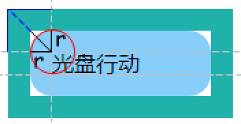
<body><div class="box">光盘行动</div>
</body>
.box{
    width:100px;line-height:1em;padding:1em;background-color:lightskyblue;border-radius:1em;
}

方形变圆
对一个正方形,只要border-radius的半径大于等于50%的边长即可。
<body><div class="box"></div>
</body>
.box{
    width: 100px;height: 100px;background-color:lightskyblue;border-radius:50%;border-radius:50%/50%;border-radius:50% 50% 50% 50%/50% 50% 50% 50%;
/* border-top-left-radius: 50% 50%;border-top-right-radius: 50% 50%;border-bottom-left-radius: 50% 50%;border-bottom-right-radius: 50% 50%; */
/* border-radius: 60%;border-radius:60%/60%;border-radius:50px;border-radius:50px/50px;border-radius:60px;border-radius:60px/60px;*/
}
border-radius:水平半径/垂直半径。
百分比,水平半径相对于宽度计算,垂直半径相对于高度计算。


长方形变椭圆
<body><div class="box"></div>
</body>
.box{
    width: 200px;height: 100px;background-color:lightskyblue;border-radius:100px/50px;border-radius:100px 100px 100px 100px/50px 50px 50px 50px;
/* border-radius:50%;border-radius:50%/50%;border-radius:50% 50% 50% 50%/50% 50% 50% 50%;*/
}


(长)方形变半椭圆
<body><div class="box"></div>
</body>
- 开口朝下
.box{
    width: 100px;/* width: 200px; */height: 100px;background-color:lightskyblue;border-radius:50% 50% 50% 50%/100% 100% 0 0;/* border-radius:50%/ 100% 100% 0 0; *//*border-top-left-radius:50% 100%;border-top-right-radius:50% 100%;*/
}


- 开口朝上
.box{
    width: 100px;/* width: 200px; */height: 100px;background-color:lightskyblue;border-radius:50% 50% 50% 50%/0 0 100% 100%;/* border-radius: 50%/0 0 100% 100%; *//*border-bottom-left-radius:50% 100%;border-bottom-right-radius:50% 100%;*/
}


- 开口朝左
.box{
    width: 100px;height: 100px;background-color:lightskyblue;border-radius:0 100% 100% 0 / 50% 50% 50% 50%;/* border-radius: 0 100% 100% 0 / 50%; *//* border-top-right-radius:100% 50%;border-bottom-right-radius:100% 50%; */
}

- 开口朝右
.box{
    width: 100px;height: 100px;background-color:lightskyblue;border-radius:100% 0 0 100% / 50% 50% 50% 50%;/* border-radius: 100% 0 0 100% / 50%; *//* border-top-left-radius:100% 50%;border-bottom-left-radius:100% 50%;*/
}

(长)方形变1/4椭圆
.box{
    /* width:100%; */width: 200px;height: 100px;background-color:lightskyblue;border-radius:0 100% 0 0/0 100% 0 0 ;
}

边框内圆角
里面是圆角,外面是直角。

第一种方案
两个div。
<body><div class="container"><div class="content">光盘行动</div></div>
</body>
.container{
    display:inline-block;padding:1em;background-color:lightseagreen;
}
.content{
    width:100px;background-color:lightskyblue;line-height:1em;padding:1em;border-radius:1em;
}
第二种方案
一个div。
- border/box-shadow/outline与border-radius
.box{
    width:100px;background-color:lightskyblue;line-height: 1em;padding:1em;border-radius:1em;border:5px solid lightseagreen;/* box-shadow:5px solid lightseagreen;outline:5px solid lightseagreen; */
}

outline不跟随圆角,所以outline和圆角之间有间隙;
box-shadow跟随圆角,所以box-shadow和圆角之间没有间隙。
要实现边框内圆角,可以用box-shadow的扩展半径 填补 outline与圆角之间的间隙。
要填补间隙, box-shadow的扩张半径要多长?
( 2 ? 1 ) 圆 角 半 径 ? 扩 张 半 径 ? o u t l i n e 宽 度 (\sqrt2-1)圆角半径 \leqslant扩张半径\leqslant outline宽度 (2??1)圆角半径?扩张半径?outline宽度
<body><div class="box">光盘行动</div>
</body>
.box{
    margin:50px;width:100px;line-height: 1em;padding:1em;border-radius: 1em;background-color:lightskyblue;outline: 10px solid lightseagreen;
}
所以,这里将box-shadow的扩张半径设置为8px,足够!
.box{
    margin:50px;width:100px;line-height: 1em;padding:1em;border-radius: 1em;background-color:lightskyblue;outline: 10px solid lightseagreen;
}

第三种方案
使用伪元素
<body><div class="box">光盘行动</div>
</body>
.box{
    margin:50px;width:100px;line-height:1em;padding:1em;border-radius:1em;background-color:lightskyblue;position:relative;
}
.box:before{
    content:"";position: absolute;top:-10px;bottom:-10px;left:-10px;right:-10px;background-color:lightseagreen;z-index:-1;
}
